

Widgetkit is a very simple yet gives ultimate page building experience, when merged with Elementor Page builder. Build simple to complex, any layouts the way you like with help with Widgetkit.

Key Features
- Slider with animation.
- Countdown.
- 4 style team block
- Portfolio 4 style with filter
- Custom blog 5 items
- Testimonial 3 styles
- 4 Differents pricing with tab
- Social share with animation
- Custom carousel with post
- Button with 10 hover animation
- Modal with shortcode and video
- Feature hover effect with image and icon
- Title Animation
- Hover Image
- Call to action
Requirements
In order to make Widgetkit work smoothly, you need to fulfill this requirement listed below.
- Wordpress: 4.0+
- PHP 5.4
Install from WordPress repository
Go to your admin panel then click on Plugins>Add New> Widgetkit>Active>
Download
Head over to Widgetkit download page on www.wordpress.org and download the widgetkit-for-elementor.zip file. In this .zip file, you have everything you need.
Installation
Installing WordPress
To install this plugin, you must have a working version of WordPress already installed on your server. If you need help installing WordPress, go through the link and follow the instructions: Installing WordPress
Installing The Plugin
It's an absolutely simple process to install the plugin on your WordPress site. Follow the instruction below.
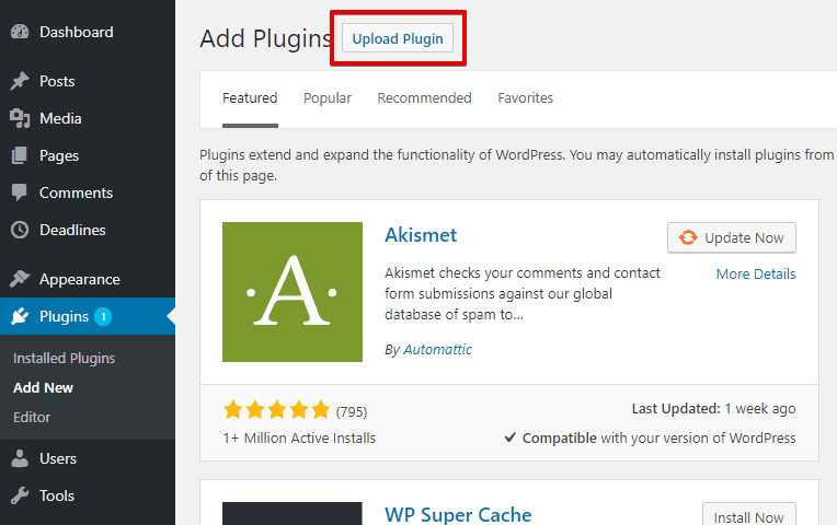
- Log in to your WordPress Administration Panels.
- Go to
Plugins> Add Newthen click on the Upload Plugin button at the top of the module.
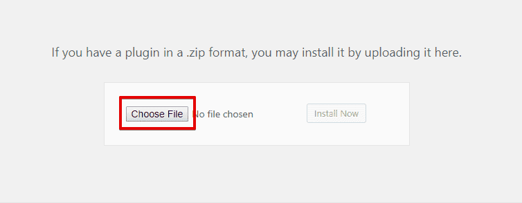
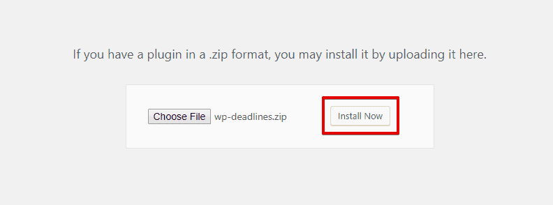
- Click on Choose File and select the downloaded wp-deadlines.zip file from the directory you saved.
- Now, click on Install Now button to let the installation process begin.
Activate Widgetkit
- Roll over to
Plugins> Installed Plugins
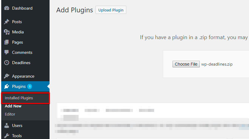
- Find the Widgetkit on the plugin list and click on the Active button to activate it.

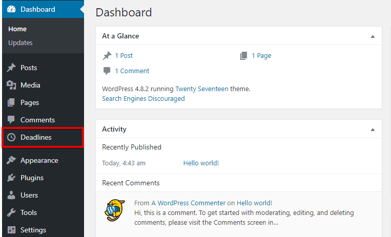
Once you are done activating Widgetkit, an additional menu named Widgetkit would be found on the left sidebar.
Widgetkit Settings
About
The about section of the plugin is described at here. Join newsletter, community forums, facebook group, or checkout the documentation by one click from here.
Elements
From this tab you will be able to activate or deactivate any element you want. Just toggle the button of an element and click on save settings and the element will be instantly activated or deactivated.
Once you deactivate an element, the section made with that deactivated element will be deactivated as well. Info Info shows your sites basic informations.
How To’s
We have integrated Widgetkit with the most popular page builder Elementor.
Use Widgetkit in Elementor
- Click on ADD NEW SECTION to add a new section in order to place Widgetkit.
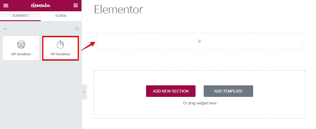
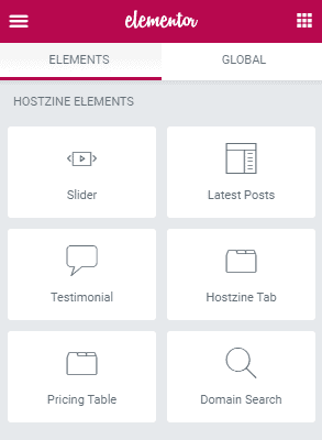
- Search WIDGETKIT ELEMENTS on the elements list. Having found, you can see all the elements under widgetkit at one place.
To explore what you can do with Widgetkit click on here.
Widgetkit Elements
You can simply add an element on a page. All you need to do, just drag the element you want to add and drop it in a page then customize its setting as your preferences. You can add our developed elements from the WIDGETKIT ELEMENTS tab on the elementor.
Elementor
Elementor is the one of the best Drag and Drop visual editor for building pages, posts etc. in a WordPress site. If you are not familiar with Elementor, we recommend you to take a look at the following videos:
-
Getting Started with Elementor: Getting Started With Elementor - YouTube
-
Sections & Columns Part 1 : Learn How to Build Your Page Layout on Elementor
-
Sections & Columns Part 2 : Style Options for Sections and Columns
- Sections & Columns Part 3 : Padding, Margin, Responsive and Other Settings in the Advanced Tab
Under http://docs.elementor.com/ you can find see the complete documentation of elementor page builder.
IMPORTANT: You have to disable Disable Global Colors and Disable Global Fonts options from
Elementor> Generalin order get your custom styles worked on any elements.Our widgetkit elements can be found in WIDGETKIT ELEMENTS tab under Elementor.
Filterable Portfolio

To add Filterable Portfolio element on a page, first-
- Go to
Pages - Click on Edit With Elementor
- Drag the Filterable Portfolio from the left WIDGETKIT ELEMENTS area and drop on your page.
- Customize the settings how you prefer and click on Save button to save the pages.
Content

Under Slides, you have this options
-
ADD ITEM : This button allows you to create new slider items. Having created an item, just by a single mouse click- there are a couple of options will appear below this.
- Portfolio Title : Choose a suitable title for your portfolio from here.
- Upload Thumb Image : Upload your thumbnail image from this option.
- Upload Full Image : Upload full size portfolio image from this option.
- Portfolio Description : Enter any text you like to add on your portfolio description.
- Filter : Define your tab or filter name with this option.
- Filter Tag : Define tag for your filter at here.
- Demo Link : Provide a link for the demo option at here.
Style

Under Title you have these options:
- Title Color : Choose preferred title color from here.
- Title Typography : Set custom typography from here.
- Span Color : Choose preferred span color from here.
- Span Typography : Set custom span typography from here.
- Title Padding : You can set custom padding from here.
Under Content you have these options:
- Content Color : Choose color of your content.
- Content Typography : Set custom typography for your slider contents from here.
- Content Spacing : Manage letter spacing between contents from here.
- Description Padding : Set custom padding on the description from here.
Under Button option you have these options.
- Typography : Set typography for button from here.
- Background Color : Set background color for your button from here.
- Border Type : Set border type from this option.
- Width : Set Border Width.
- Color : Set Border Color.
- Border Radius : Set Border Radius.
- Box Shadow : Access different box shadow options from here.
- Padding : Give custom padding to box from here.
Under Front Image you have these options.
- Front Image Position : Set image position.
- Image Size : Make your image bigger or smaller according to your need.
Advanced

- Element Style : Control margin, padding, z-index, entrance animation and add additional id or class to apply your custom design to an element.
- Background : Control element background color, hover style and more.
- Border : Apply your custom border style configuring different options from this tab.
- Responsive : Control making this element to appear on various devices.
- Custom CSS : Write your custom CSS code at here.
Slider
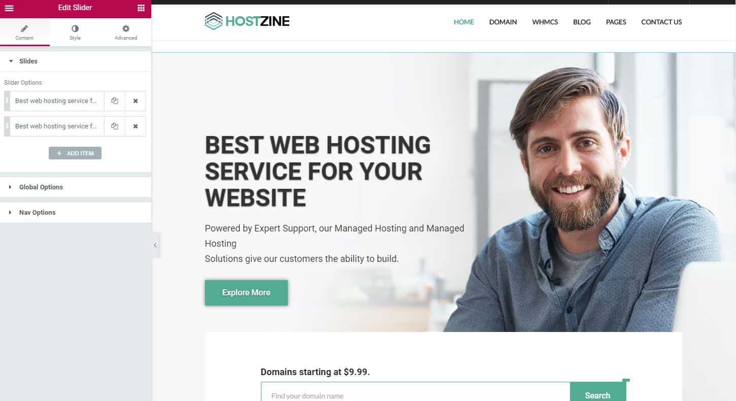
To add Slider element on a page, first-
- Go to
Pages - Click on Edit With Elementor
- Drag the Slider from the left HOSTZINE ELEMENTS area and drop on your page.
- Customize the settings how you prefer and click on Save button to save the pages.
Content
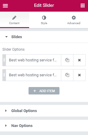
Under Slides, you have this options
- ADD ITEM : This button allows you to create new slider items. Having created an item, just by a single mouse click- there are a couple of options will appear below this.
Inside slider options, on Background tab you have this option
- Background : Choose the background image for your slider at here.
On Content tab you have these options
- Content : Define Image, Description and Title for your slider.
Under Global Options you have this functions
- Slider Height : Define the slider height.
- Caption Position : Define position for the caption.
- Content Alignment : Choose content alignment from here.
- Slider Interval : Choose the time for slider interval. [Time is calculated in milliseconds.]
- Background Overlay : Define background overlay from here.
- Background Repeat : Define the repeat option.
- Background Size : Define the size of your background.
- Background Position : Choose the background position.
- Background Attachment : Choose the background attachment type.
Under Nav Options you have this options.
- Nav Enable/Disable : Toggle to enable or disable nav.
- Arrow Enable/Disable : Toggle to enable or disable arrows.
- Nav & Arrow Icon Color : Define Icon color for Nav & Arrow.
- Nav & Arrow Bg Color : Define background color for Nav & Arrow.
Style
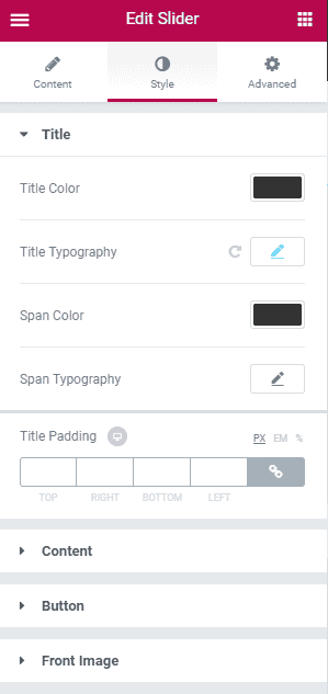
Under Title you have these options:
- Title Color : Choose preferred title color from here.
- Title Typography : Set custom typography from here.
- Span Color : Choose preferred span color from here.
- Span Typography : Set custom span typography from here.
- Title Padding : You can set custom padding from here.
Under Content you have these options:
- Content Color : Choose color of your content.
- Content Typography : Set custom typography for your slider contents from here.
- Content Spacing : Manage letter spacing between contents from here.
- Description Padding : Set custom padding on the description from here.
Under Button option you have these options.
- Typography : Set typography for button from here.
- Background Color : Set background color for your button from here.
- Border Type : Set border type from this option.
- Width : Set Border Width.
- Color : Set Border Color.
- Border Radius : Set Border Radius.
- Box Shadow : Access different box shadow options from here.
- Padding : Give custom padding to box from here.
Under Front Image you have these options.
- Front Image Position : Set image position.
- Image Size : Make your image bigger or smaller according to your need.
Advanced
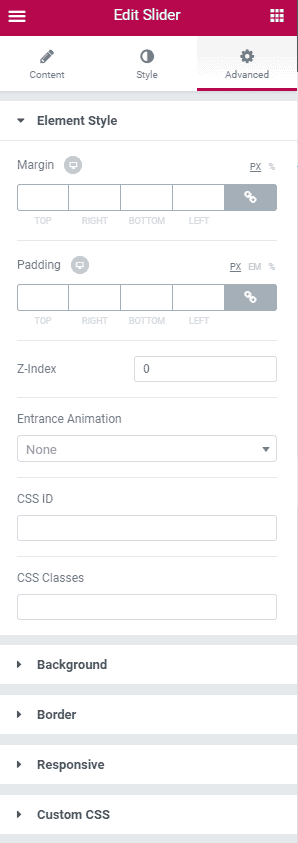
- Element Style : Control margin, padding, z-index, entrance animation and add additional id or class to apply your custom design to an element.
- Background : Control element background color, hover style and more.
- Border : Apply your custom border style configuring different options from this tab.
- Responsive : Control making this element to appear on various devices.
- Custom CSS : Write your custom CSS code at here.